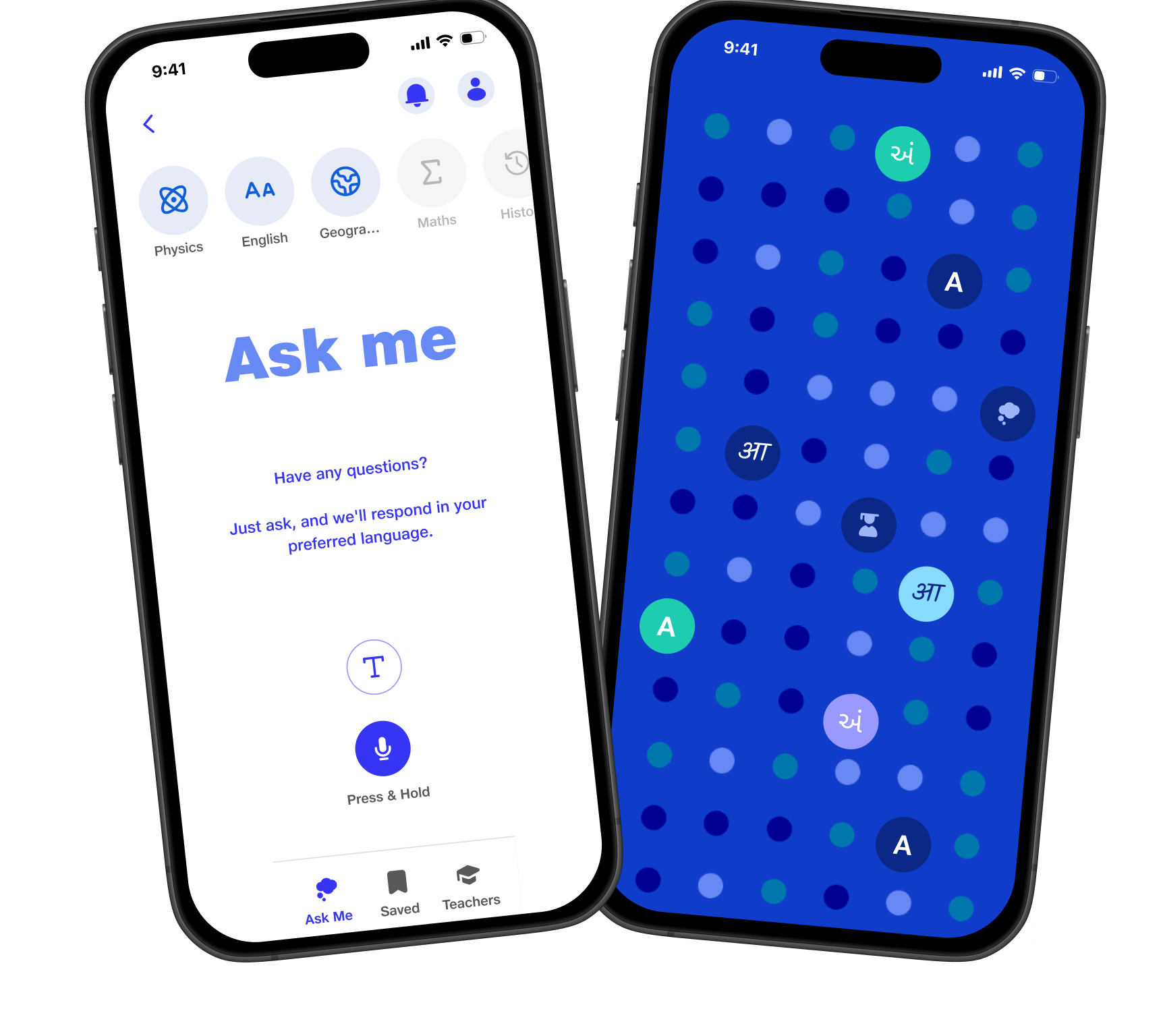
Overview
First, a little overview
About Jio
Jio Platforms runs India's largest mobile network and the MyJio app. JioShiksha was a product for schools that I designed during my time there.
What JioShiksha does
It connects the three people around a child's schooling. Students ask doubts by voice or text and get answers in their own language. Teachers send study updates and feedback as a voice note. Parents, even without a smartphone, call a toll free number to hear those updates and reply.
My Role
Associate UI/UX Designer: user journeys, the student and teacher apps, and the parent call flow.
Platform
An Android app for students and teachers, and a toll free phone line (IVR) for parents.
Keynotes
The context
Three people, three languages, and not everyone has a smartphone
A teacher, a student and a parent can each be most comfortable in a different language. Many parents only have a basic phone. So school updates usually arrive as English text that some parents cannot read, or they never arrive at all.
through the app
through a phone call
Every message reaches each person in their preferred language.
Who I designed for
Student
Asks doubts out loud
Studies in the language they think in. Wants a quick answer to a doubt without typing a long question in English.
Teacher
Talks faster than they type
Teaches many sections a day. Wants to share homework, progress and feedback with a whole class, or one parent, without writing it all out.
Parent
May not have a smartphone
Cares about their child's progress but may not read English or use apps. Has a phone, and can always make a call.
The problem
School talk was written, in English, and only for app users
Mapping the journeys of all three users showed the same gaps from different sides. Each one cut someone out of the conversation about the child.
English only
Most school apps speak only English, so a parent who reads Marathi is left out.
Parent
Typing is a barrier
Writing a full doubt on a phone keyboard takes far longer than just asking it.
Student
No app, no updates
A basic phone cannot install an app, so updates never reach some parents at all.
Parent
Writing every update
Typing the same feedback again and again for each student and parent eats a teacher's evening.
Teacher
Answers get lost
A good explanation disappears once the chat is closed, right before the exam.
Student
The approach
Meet each person on the channel they already use
Instead of forcing everyone into one app, the design gives each person the easiest way in, and lets language travel with the message.
01
Language first
Everyone picks a default language before anything else, and can change the input, text and audio language at any time.
02
Voice over typing
Press and hold to ask or to record. Typing is always there, but never required.
03
No smartphone needed
Parents get the same updates over a toll free call, with menus in their own language.
The solution
Breaking down the design piece by piece
Each piece answers one of the gaps above, for the person who felt it most.
1. Language before anything else
Problem identified
An English-first app loses people on the very first screen.
What I did
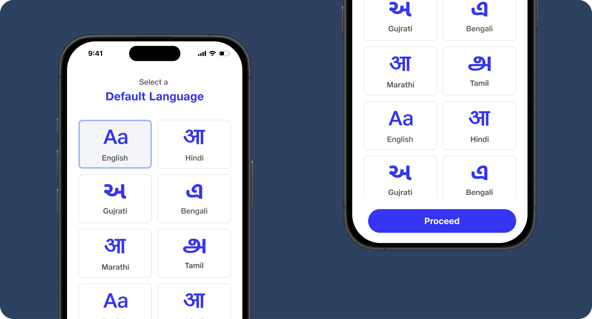
Right after log in, people pick a default language. Each option is shown in its own script (Aa, आ, અ, এ, அ), so anyone can spot theirs at a glance. In the profile, the input language, the text answer language and the audio answer language can each be set separately.
2. Ask me: a doubt solver that listens
Problem identified
Typing a long doubt in English was slow and put students off asking at all.
What I did
Ask me opens on just two actions: type, or press and hold to speak, filtered by subject. The answer comes back as text in the default language, and can be played as audio in another language, with Change audio language right under it.
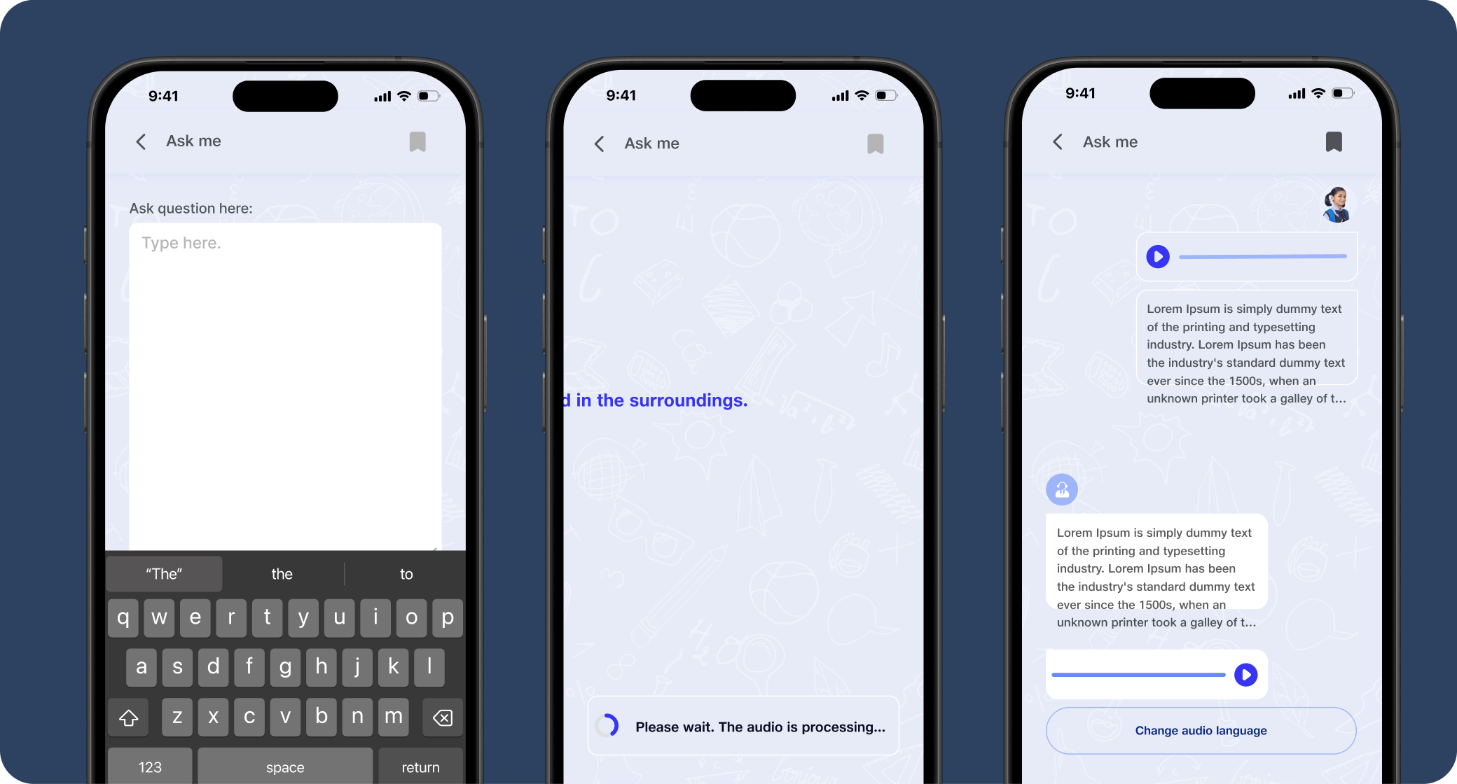
Students can keep the conversation going, or save the whole thing for later.
3. Nothing gets lost
Problem identified
Explanations and teacher updates disappeared once the screen was closed.
What I did
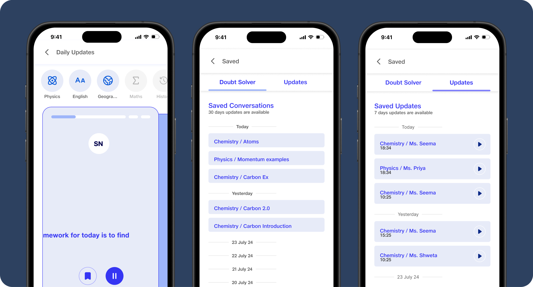
Saved holds two tabs: Doubt Solver conversations, kept for 30 days, and teacher Updates, kept for 7 days, grouped by day and subject. Daily updates from teachers play like a voice message and can be filtered by subject.
4. Feedback by voice, sent to the right people
Problem identified
Teachers were writing the same update many times over, for every student and parent.
What I did
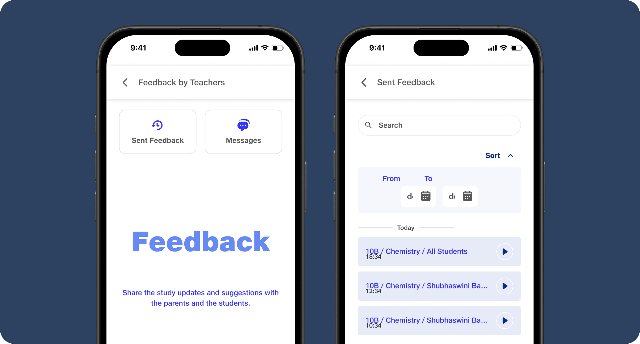
The Feedback tab records one voice note and processes it. The teacher then picks the grade, section, subject and dates, and sends it to all students, all parents, or chosen students. Sent feedback and replies from parents sit in one list the teacher can search and sort.
5. Parents call in, no app needed
Problem identified
Parents with basic phones could not install the app, so they missed every update.
What I did
Parents call a toll free number from their registered mobile. On the first call they link the number to their child with the student ID and an OTP sent by SMS. After that, they pick a language and a subject, listen to the teacher's message, or record a reply after the tone.
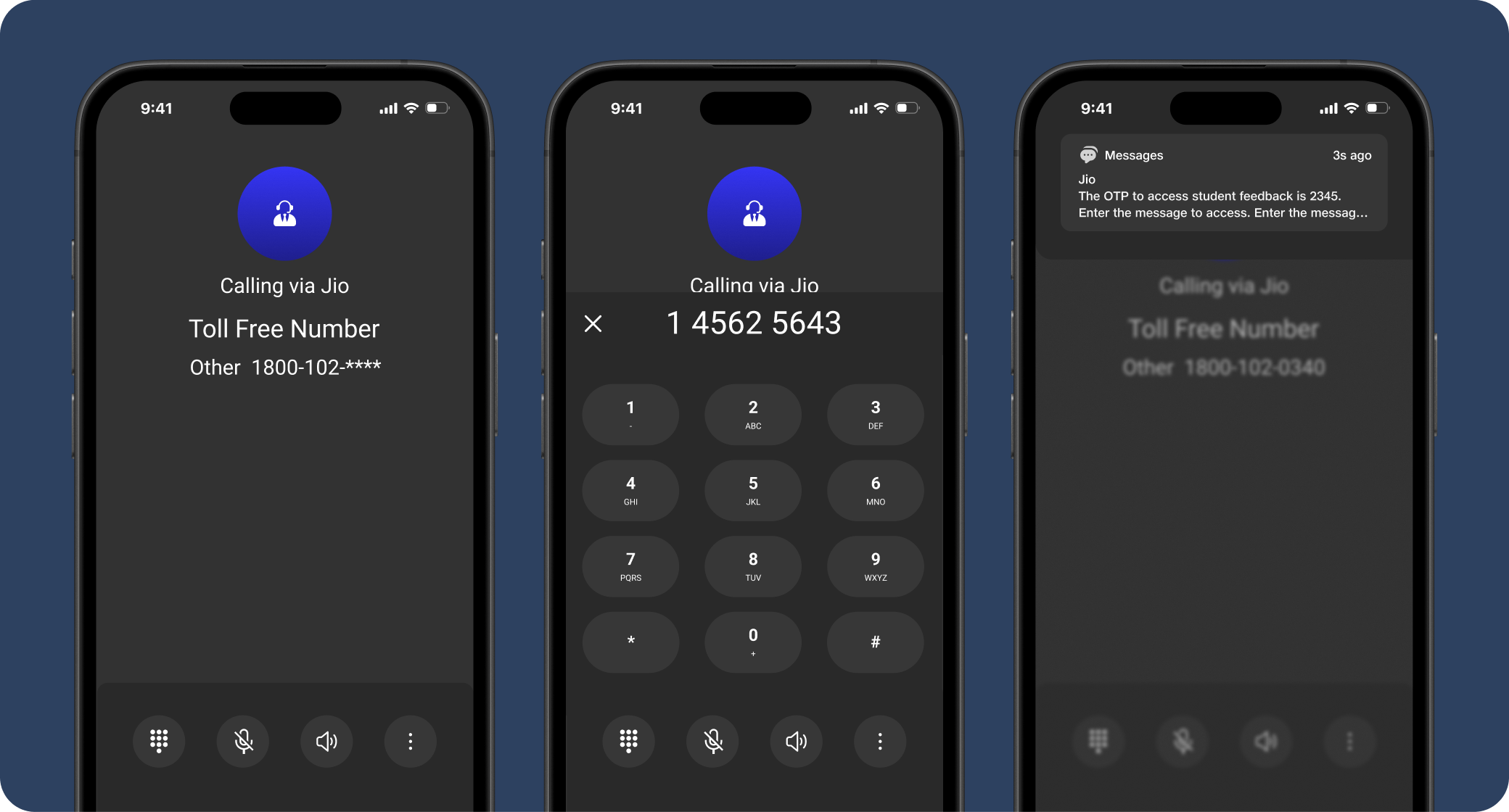
First call only: enter the student ID, then the OTP from the SMS, to link the number.
Where it landed
Designed end to end, then paused before launch
JioShiksha did not go live. Jio paused it before launch after a business decision, so there are no usage results to share. The design covered the whole loop: the student app, the teacher app and the toll free call flow for parents, each in the language they speak.
What I would do differently next time
- 01
Test the call flow with real parents. A voice menu is easy to get lost in. I would test the menu depth and the order of languages with parents before building it.
- 02
Design for the wrong student ID. If a parent links to the wrong child, the whole channel breaks. I would add a simple way to check and unlink a number.
- 03
Try answers with real doubts in every language. The designs used placeholder answers. I would test real questions and audio quality in each language with students.